Asllani Family Dental Clinic
An identity for a family-run dental practice — built around warmth, trust, and the quiet confidence patients want from their clinic.
Asllani Family Dental Clinic is a multi-generational dental practice run by Drs. Jakup, Arta, and Agon Asllani. They needed an identity that reflected the reality of their work — that a dental visit is rarely just about treatment. For most patients, especially families and children, it's about feeling safe, cared for, and understood. The previous identity didn't communicate that. The new one had to.
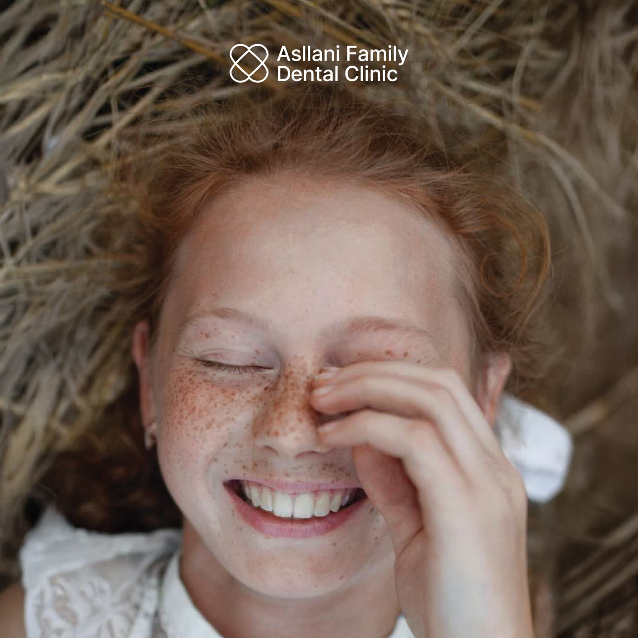
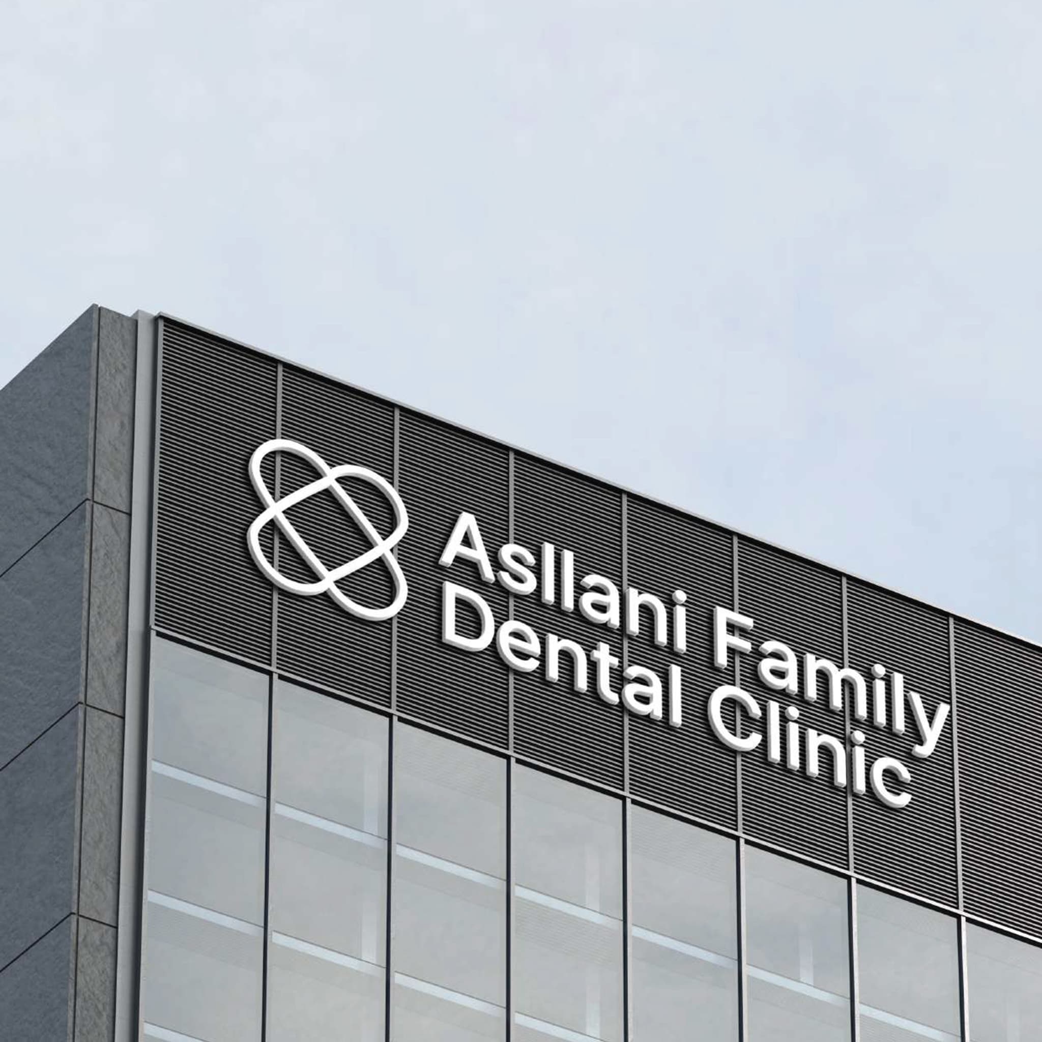
We designed the mark as two interlocking forms held together as one — a continuous, symmetrical shape that reads as a soft seal of care rather than a clinical icon. The geometry is precise but the silhouette stays gentle, avoiding the cold feel that dental branding so often falls into. The wordmark sits in a humanist sans-serif — open, friendly, easy to read across signage, social, and patient-facing materials. The palette is built around a calm, restorative blue that feels reassuring rather than sterile. The system flexes from large-scale architectural signage down to small social applications without losing its character.
A dental identity that puts the patient before the procedure.
- A custom symbol formed of two interlocking shapes — a continuous seal of care rather than a clinical icon
- Humanist wordmark designed for clarity at every scale
- A calm, restorative blue palette chosen to reassure rather than clinical-white
- A flexible system designed to live across signage, print, social, and digital
- Built for a multi-generational family practice — Drs. Jakup, Arta, and Agon Asllani