Work / 07 — Identity · Brand System
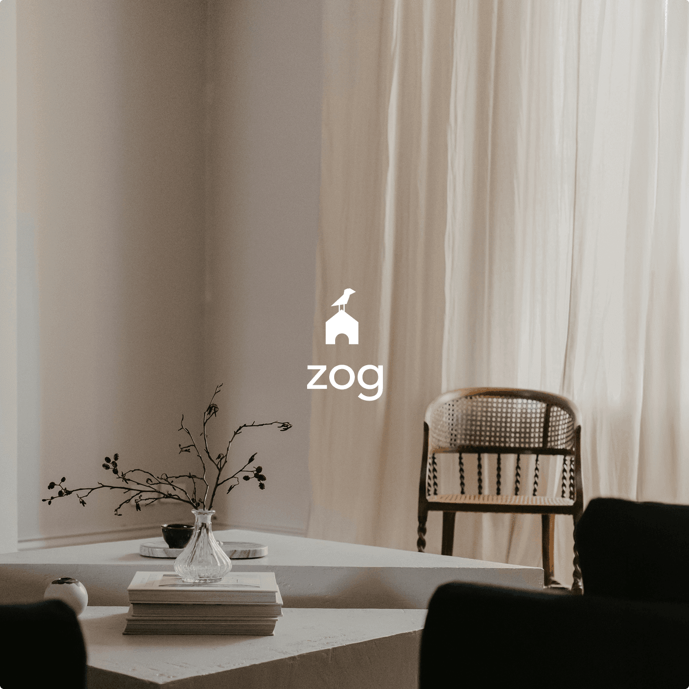
ZOG
Timeless interiors, defined by quiet detail.
The brief
Zog creates timeless interior spaces defined by simplicity, balance, and refined detail. Each design is thoughtfully shaped to feel elegant, functional, and naturally connected to the people who live in it.
The approach
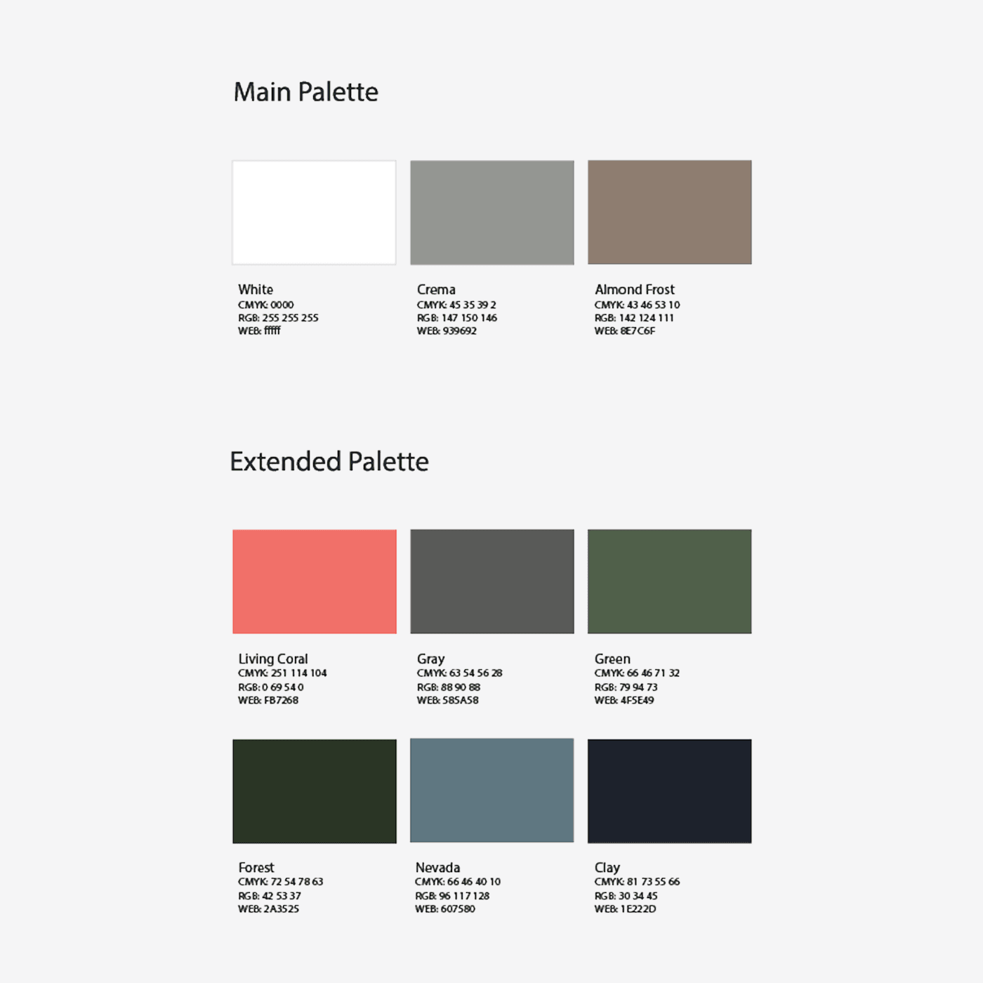
Transad developed the full brand identity — including the wordmark, signature bird-and-arch mark, and a calm material-first colour system that mirrors the studio's design ethos.
About the project
A timeless identity for a quiet, considered design studio.
- A wordmark designed for quiet legibility — restrained, balanced, distinctly the studio's
- A signature bird-and-arch monogram serving as the brand's compact mark
- A calm, material-first colour system derived from interior surfaces and natural finishes
- A complete identity package: marks, typography, colour, and application guidance